Campaign and Branding Strategy
Ultomiris New Campaign: So Effective, Patients Forget They Have the Disease
San Francisco | California
Associate Designer Director | VMLY&R
The latest Ultomiris Campaign ingeniously integrates the brand's colors as a protective shield against the debilitating effects of the aHUS disease. Patients depicted in the campaign exude vibrant energy, showcasing their ability to pursue their daily activities without feeling weighed down by the burdens of aHUS. In essence, they exclaim, "I almost forgot about aHUS!" The campaign spans various platforms, including websites, brochure packaging, podcasts, and more, ensuring widespread reach and impact. By leveraging Ultomiris's branding colors throughout the campaign, we enhance brand recognition and reinforce the message of empowerment and vitality for aHUS patients.
"Almost Forgot aHUS" Campaign:
The gradient from violet to orange indicates that the patient is using Ultomiris, emitting a green flair symbolizing a speech bubble.
"Almost Forgot aHUS" Campaign:
Embraces diversity with multiple racial backgrounds and age groups among its patients.
"Almost Forgot aHUS" Campaign:
The charts and data are structured in an infographic style to facilitate easy and swift comprehension.
The mobile site replicates the desktop design, framing bite-sized information visibly.
The site offers a unique experience where viewers can journey through the blood vessel to explore the complement system as they scroll down the website.
The site concludes with OneSource, inviting patients to sign up for additional information to be sent to them.
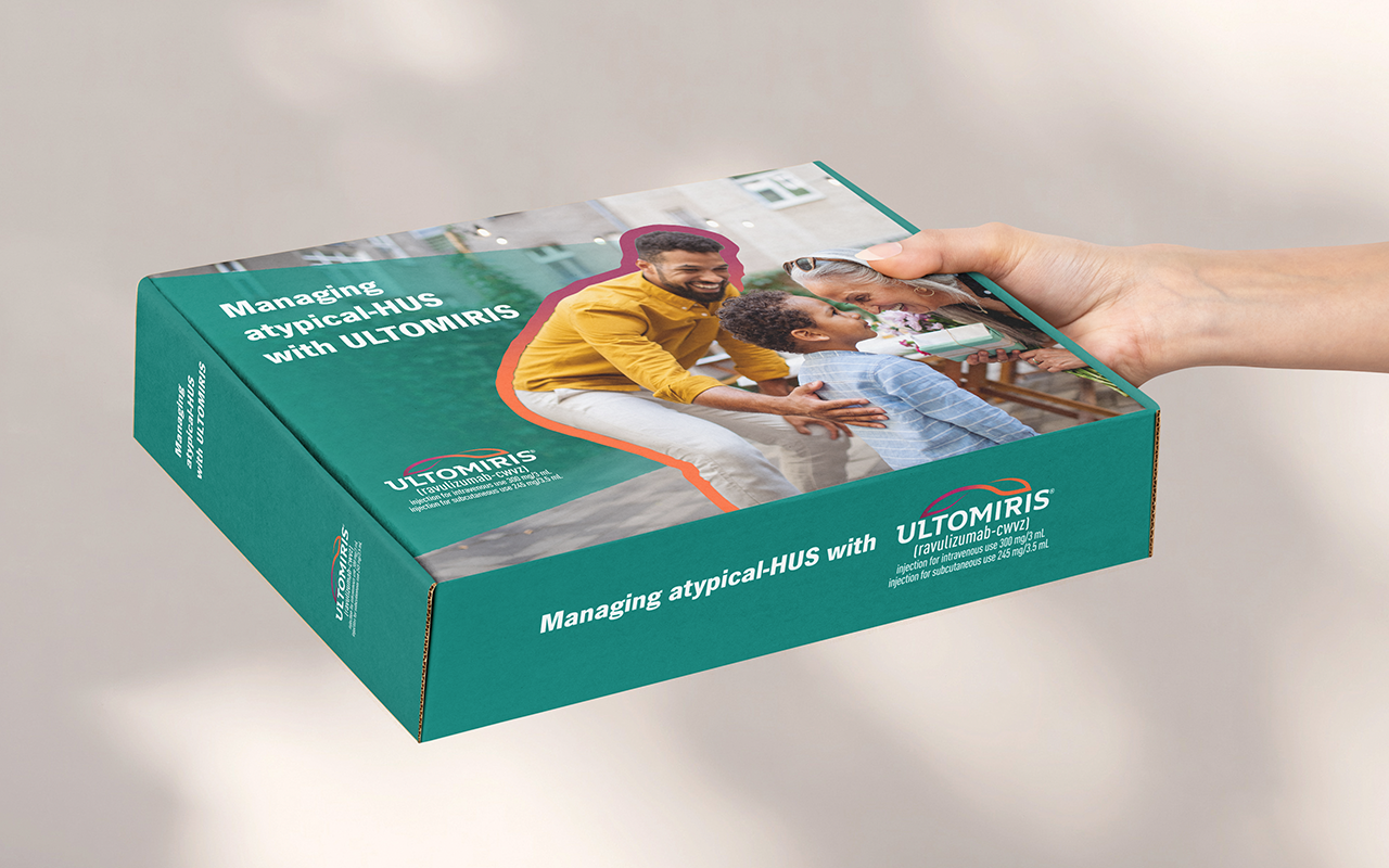
aHUS Patient Kit
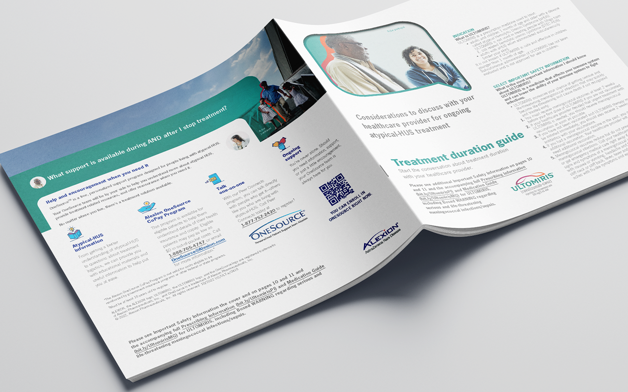
As previously mentioned, once patients reach the OneSource section and provide all the necessary information, the kit is initially dispatched to them. Subsequently, additional brochures or information are sent to them over time.
Each discussion brochure features a speaker bubble cut-out, revealing the message inside, adding a unique touch to the aHUS kit.
Each discussion guide brochure is uniquely crafted, utilizing various formats such as trifold, bi-folds, etc., enabling patients to quickly identify them within the kit.
The outer casing of the kit features a belly banner where all safety information is housed, ensuring that the kit itself is not burdened with excessive medical safety warnings. This enhances the kit's visual appeal, making it more enjoyable to look at.
Here are some excellent pathways to explore if you're seeking a creative art director.


