Brand Strategy | Design
A logo for the digital age
San Francisco | California
Designer Director | Freelance
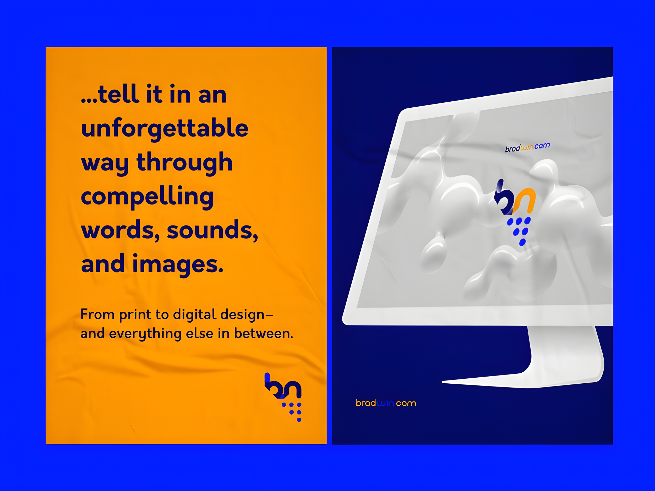
I find inspiration in the simplicity and symbolism of the circle, a representation of the digital era. Through the fusion of two circles to form the monogram's two letters, the design embodies a powerful concept. Its simplicity belies its impact, as the subtle movement of the letters within the circular framework creates a dynamic visual effect. This design philosophy captures the essence of modernity and innovation, making a statement that resonates with viewers on both a visual and conceptual level.
The logo, initially a circle, transforms with multiple points resembling a triangle, akin to the binary essence of computer programming. It symbolizes the evolution from simplicity to complexity, reflecting the process of building intricate digital systems from fundamental components
The campaign employs a straightforward approach, utilizing bold and vibrant colors alongside impactful language to convey the message that the designer embodies a no-nonsense attitude.
By opting for vivid hues and powerful words, the campaign captures attention and communicates the essence of the designer's straightforward and uncomplicated nature.
This strategic use of color and language creates a bold statement, aligning perfectly with the designer's persona and showcasing their preference for simplicity and effectiveness in both design and communication.


